
Cambio Mobile App
A mobile app for frequent global travelers to perform complex calculations with multiple currencies.
EXECUTIVE SUMMARY
As a personal project, I designed Cambio, a mobile app financial tool. It helps frequent global travelers easily search for various currencies and perform complicated calculations between currencies with its multicurrency calculator.
I committed to completing this project in three weeks in order to explore and design mobile app concepts quickly and gain experience in new areas of user experience design. Because of the short time frame, I had to make design decisions quickly and rely on continuous user feedback to improve my designs. As the owner of this project, I was able to adapt to changes easily without impacting my project timeline.
THE PROBLEM
I used my experience and challenges with currency exchange apps as a starting point for my research. My initial hypothesis evolved as I began to understand my users and their varying needs.
My initial hypothesis was based on my experience with currency mobile apps.
As a frequent traveler (and terrible mathematician), I am always using my currency converter app to make sure I'm getting a good deal. Many of the apps are clunky and even as a frequent user, I often have to waste time trying to remember how to do basic tasks such as,
-
Add a new currency to convert
-
Perform calculations between different currencies
-
Quickly understand how far off the rate I am being given at the exchange counter is.
Initial Problem Statement
Frequent travelers and investors need to make decisions quickly when exchanging currencies. How can we make the currency conversion process simple and provide users with the information they need to convert money when the rate is right?
When I began my research, I thought my app would attract three types of users.
-
Expats who transfer money back home
-
Forex traders
-
Frequent global travelers
After my interviews, I realized each of them of them have very different needs when using a mobile app for currency exchange purposes.
MAKE OF THE TEAM
MY ROLE
I initiated this project, developed the 3-week project plan, performed user research, designed the mobile app, and tested my design with users.
Although I worked on this project independently, I relied heavily on my users to drive design decisions which made it feel like I wasn't alone in this challenge.
UNDERSTANDING THE USER
As someone living in a country where the majority of residents are expats, it was easy to identify people who would be users of my app and face similar challenges.
The very nature of being an expat is that we live away from our home country, earn our salaries in a currency different than our home currency, and travel often. They often have many currencies saved from many trips, have to make quick conversions, and don’t have time to waste.
I identified people who travel frequently and are already users of currency exchange apps so they would be familiar with the functionality that already exists and have ideas for additional features.
3-Week Project Timeline

BREAKING DOWN THE PROCESS
WEEK 1 | RESEARCH
To understand the competitive landscape and how users interact with financial and productivity travel tools, I identified popular currency apps to compare features, observed users interacting with those apps, and developed a set of personas.
I identified three currency conversion apps based on most frequently downloaded apps in the Apple App Store, online reviews, and suggestions from frequent travelers. I observed my users as they played with the apps and walked through each of the screens with them to better understand what they liked, their pain points, and ideas for enhancements.
XE
-
Large number of performance issues
-
Ads are a distraction and obtrusive
-
Often used for transferring money and trading
Elk
-
Have to pay to add less common currencies
-
"sacrificed usability and functionality for minimal design"
-
"the UI is pretty, but at the expense of a good UX"
Currency
-
Positive ratings - no bells and whistles
-
Limited functionality
-
Easy to navigate
-
Ads do not distract
Surrugate research showed that many apps sacrificed good UX for good UI.
Analysis
There are a lot of currency exchange apps available and all provide generally the same functionality to complete the basic function of calculation currency exchange. They lack in features necessary for frequent travelers and people who spend more time abroad or investing. Overall, they are more fit for purpose for casual users.
My research showed that when the focus was on a good visual design, they sacrificed functionality and usability.
Personas
Frequent travelers need tools that are quick to learn because when it comes time to perform calculations, clunky designs and disruptive experiences (award winning Elk app) slow users down.
I created three personas:
-
Ana, an expat who frequently transfers money back home
-
Margaret, a novice forex trader
-
Michael, a frequent global business traveler
Initially, I thought I would have a one size fits all approach to the design. However, my research showed me that an optimal design for a frequent traveler may be different than for an investor.
For example, a traveler would only need to see one conversion at a time, their home currency vs. the foreign currency. On the other hand, an investor or forex trader may want to have a view of rates across different currencies at a point in time.
Design options:
-
Design for one persona only and limit the design.
-
Add an onboarding screen to allow people to customize their view
Because people can fall into more than one persona, I decided to design an app with customized views for Ana, Margaret, and Michael's needs.
My research showed me that the design for a frequent traveler should be different than an investor.
WEEK 2 | PRODUCT DESIGN
I used Michael's story as the basis for my storyboarding and wireframes, while also keeping Ana's and Margaret's needs in mind.
I referred to Michael throughout the development of my design. As my design evolved, so did my understanding of my target users.
Michael's Story
Michael has just arrived in China and is line at the currency exchange counter at Beijing's busy airport. When searching through his wallet, he realizes she has leftover Euros and GBP from a recent trip. It's almost his turn and he wants to know how many Euros and GBP he has in Chinese Yuan so he feels confident he isn't getting ripped off at the currency exchange counter.

Michael travels overseas monthly for work and visits the exchange counter at his destination airport. He often has leftover currency saved up from previous travel.
Design Evolution
I focused my designs on the following screens:
-
Onboarding
3-screen onboarding to provide brief overview of app functionality
-
Convert
Standard 1-to-1 currency converter
-
Multicurrency Calculator
Convert multiple currencies into a single currency in a single interface
-
Rate Checker
Confirm if the rate users received was a good deal
-
Historical Rates
Graphs of historical exchange rates to view trends
This screen was removed in the prototype phase and embedded within the Convert screen via a graph icon because users stated that although they would view charts, they wouldn't view them regularly so I could remove them from the main navigation.
-
Donate Change
Option to donate foreign leftover change.
Users expressed enthusiasm for Cambio and were thoughtful in their feedback. They were able to relate to the challenges faced with multicurrency calculations and leftover change. As frequent users of similar apps, they were able to provide thoughtful feedback as I progressed through the designs.
Currency is a language your mind thinks in.
- Global Traveler, Cambio Enthusiast
Onboarding Screen
Overview of app features
Lo-fi Wireframe

Mockup 1

Mockup 2

Lo-fi
Option to customize screen based on user type: globetrotter or an investor nomad.
Mockup 1
I removed the user customization option as the distinction between travelers and investors became less clear. I added the option to select default currencies instead of hiding it within the app settings where Michael could not easily find it.
Mockup 2
I modified the brand logo and typography to increase color contrast, improve readability, and increase accessibility.


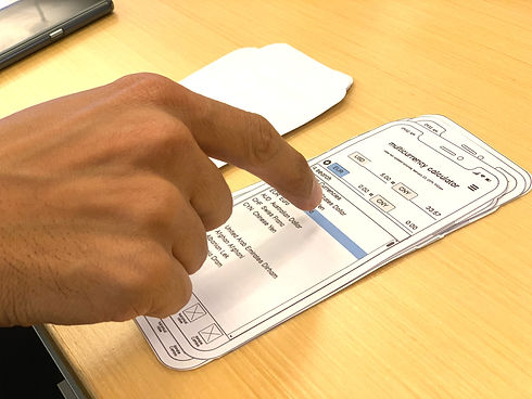
Multicurrency Calculator Screen
Convert multiple currencies into a single currency
Lo-fi Wireframe

Mockup 1

Mockup 2

Lo-fi
Numeric keyboard was built into the screen with no option for Michael to hide it.
Mockup 1
The default view has a hidden keyboard and will only appear when Michael swipes up or taps to enter a value.
Mockup 2
I increased the size of the currency selection buttons to improve Michael's usability. The button for Michael to add another row is larger and there is an info icon that will open instructions since he is a first time user.
Numeric Keyboard
Perform calculations with shortcuts to factor premiums and commission
Lo-fi Wireframe

Mockup 1

Mockup 2

Lo-fi
Users were confused by the % rates, calculate and calculate button.
Mockup 1
I added labels to the %'s and made them less prominent by reducing the button size and changing the button color. I added visual distinction between the numbers and math symbols.
Mockup 2
I added tooltip to explain use of 3-5% commission buttons. There is now 10/100/1000 shortcut buttons for quick entry.
Donate
Select charity to donate spare foreign currency
Lo-Fi Wireframe

Mockup 1
Mockup 2

Lo-fi
Users helped me think through the concept of donating spare foreign currency that would be easy for them and keep operating costs low for Cambio.
Mockup 1
Instead of relying of Cambio to provide an envelope + mailing instructions, I will partner with Amazon to provide pick-up services so Michael has a hassle-free experience when donating.
Mockup 2
I added more prompts so users Michaels knows exactly what to do. I I aligned use of colors with rest of app so Michael's experience is consistent on all screens.

TITLE OF THE CALLOUT BLOCK
LESSONS LEARNED
A few of my testers have expressed interest in developing the app and have provided additional feedback to explore.
Before trying to get Cambio into the market, there are several enhancements that need to be made and designs need to be developed for additional screens:
New screens
-
Rate alerts
-
Historical charts
-
Menu
Research
-
Although my users, like Michael, were frequent global travelers, I would like to do more research to understand if Ana and Margaret's goals can also be achieved by enhancing Cambio, while continuing to target people like Michael.
-
Investigate feasibility of ‘Donate Cambio’ partnership with Amazon or explore other ways people could donate leftover foreign change/currency.
Testing
-
Do feasibility testing with others like Michael, Ana, and Margaret to get more feedback and validate design decisions.